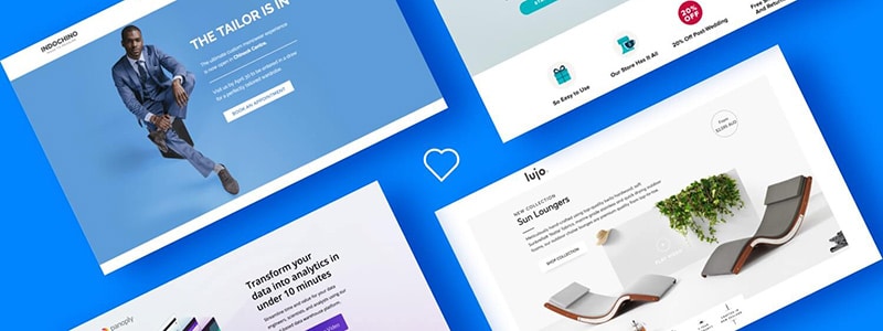
As your window to a world of new business, your website landing page needs to pack a big punch in a small amount of time. This is particularly important if you’re marketing B2B technology. Now is the best time to check that your website is attracting your visitors – not driving them away. If you haven’t already, it may also be a good time to speak with a specialist software marketing agency.
Want the Too Long;Don’t Read Version? Watch this video…
Here are the worst turn-offs for most people:
1. Videos that start playing the instant the landing page opens
Videos, flash animations, and more. With sound, of course, so you’ll really annoy your nearby colleagues at work. Or family members at home when you’re up late working. People feel ambushed or trapped when this happens, and close the tab fast.
2. Multimedia ads, pop-up ads or Calls to Action
The visitor has landed here via a search, by clicking on a link, or on an ad. Why throw an ad or call to action (invite to subscribe) in their face before they’ve had a chance to look around? There’s often no convention for turning these things off either: some have a little cross in this or that corner, and others a tiny label that says skip this ad.
3. Confused Messages
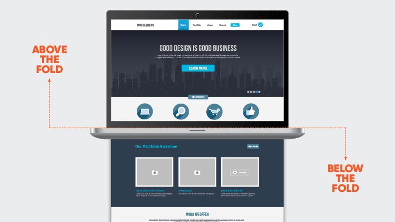
We’ve all sat there staring at the webpage we landed on, trying to figure out what it’s offering. The average span of a human’s attention is around eight seconds. Your website needs to make crystal clear in the space ‘above the fold’ what you’re offering visitors. If they don’t get your value proposition in a few seconds, they’ll leave. This is even more relevant when trying to generate SaaS and technology sales leads. If only a techie can understand the first para of copy, you could be losing the person who’s not tech-savvy, but is holding the cheque book.
4. Cluttered web pages
Busy landing pages are like people who talk to much – they annoy others. The key is to get the core message right, and to resist the temptation to bombard visitors with multiple messages. Keep it simple.
5. Poor quality Landing Page text
Sentences full of empty words, clichés and jargon are a real turn off. Be specific. Visitors want to know what you do or offer, and how that is different from what your competitors offer. Good copy is clear, concise and compelling.
6. Failing the WIIFM test
Many websites focus on selling the company or the product, and pay little attention to the needs and wants of visitors. They’re like people who always talk about themselves. Potential customers will more readily engage with your website if the content they see resonates with their particular pain-points. It’s important to speak to your prospect’s problems, and then explain how you will be able to solve them.
7. Eye-watering fonts
These tend to follow mistakes 4 and 5: if we use too many words to explain a proposition, we run out of room. It’s tempting to use smaller fonts to overcome this issue, but that’s a turn-off for many visitors.
8. Confusing calls to action
It is common for websites to tempt us with various offers and specials, yet they’d have far more success if they had a single call-to-action per page – subscribing to the newsletter, visiting the blog, downloading a resource, watching a video, booking a chat, or signing up for a trial.

9. Clunky navigation
As incredible as it seems, navigating many websites still resembles an obstacle course. Friends and colleagues who are not familiar with your product offerings make superb website navigation testers. Sit them in front of yours and see if and where they get stuck.
10. Slow-loading pages
Yes, after many decades … hard to believe, I know, but still common. It’s not just the landing page that must load fast but all the rest as well, even the ones with images or diagrams. I am always surprised to see companies working at the forefront of technology, who have websites which are slow to load due to the use of images, videos and infographics which haven’t been optimised for web.
11. Unoriginal images that add nothing
The worst are those generic stock photos of groups of happy people working in sublime harmony, carefully chosen to cover a wide range of diversity. Images are a great way to convey a message in quick time. Sure, they can still be ‘artsy’ but they really have to speak to, or support your story.
12. No blog or case studies
This is not an obvious turn-off, but savvy travellers of the web have learned that blogs and case studies may give them better insight into the kind of company they’re dealing with. But, as with all things to do with the internet – choose quality over quantity every time.
13. Design where responsiveness has not been checked and is broken
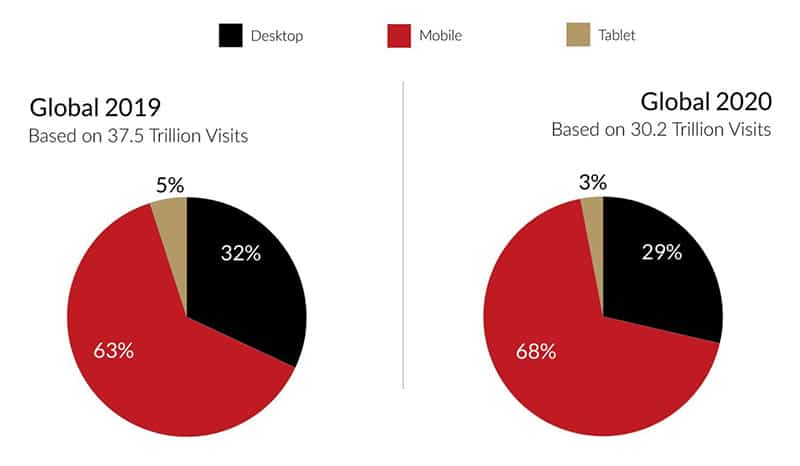
Responsive design uses cascading style sheets to make your website navigable on any device. We’ve known for some time now that smart mobile devices are overtaking PCs as the most common tools for accessing the web. Globally in 2020 over 68% of users accessed the internet with mobile devices. And while it’s difficult to find stats specifically relating to business vs personal usage, it’s safe to assume that today’s workforce is increasingly mobile – so ignore responsiveness at your peril.
An efficient and effective website landing page is your ‘silent salesman’. It’s the important first step in turning prospects into paying customers. Everything must work in perfect sync: technical, communication, visual appeal and call to action. If you don’t have an inhouse team it will be worth the investment to engage an experienced B2B sales and marketing agency, and fast-track your sales.
Edited by Jan Murphy from original article written by senior content writer for Tech Torque Systems, Kim Brebach.

